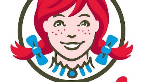
Wendy’s is a household name, synonymous with juicy burgers, crispy fries, and creamy Frostys. The brand’s logo, featuring a smiling red-haired girl with freckles and blue bows in her pigtails, is instantly recognizable. However, there’s a hidden detail in the logo that’s gone unnoticed by many, despite being a clever tribute to the brand’s roots.
The story behind Wendy’s logo is rooted in the brand’s founder, Dave Thomas, who named the chain after his daughter. Thomas wanted the brand to evoke a sense of warmth and welcoming, reminiscent of home-cooked meals shared with loved ones. To emphasize this family connection, Thomas incorporated a subtle yet meaningful detail into the logo design. Take a closer look at Wendy’s ruffled collar, and you’ll spot the word “MOM” cleverly spelled out.

This hidden message is more than just a clever design element; it’s a nod to the idea of home, love, and comfort that many associate with their mothers and the meals they prepare. By incorporating this subtle touch, the logo not only represents the founder’s daughter but also reflects a broader sense of family and tradition.
Wendy’s isn’t the only brand to include creative details in its logo. For example, the Subway logo features two arrows pointing in opposite directions, representing the entrance and exit of a subway. These clever design elements may not be immediately noticeable, but they demonstrate the thought and attention that goes into branding. They create a deeper connection with customers, making the logos memorable and meaningful.
Next time you visit Wendy’s, take a closer look at the logo and see if you can spot the “MOM” in the collar. It’s a reminder that even the simplest designs can have hidden stories, making them all the more special.


